

DIgital banks

Project Overview
UrbanHarvest, a growing organic food company, needed a refreshed brand identity to better reflect its commitment to sustainability and modern retail positioning. While the products were high quality, the existing branding lacked consistency and differentiation in competitive markets. The goal was to create a strong, recognizable visual identity that aligned with the company’s values and appealed to health-conscious consumers.
The Challenge
UrbanHarvest had strong products and a growing customer base, but its visual identity no longer reflected the quality or values of the brand. The outdated logo, inconsistent packaging, and lack of structured guidelines created confusion across marketing channels. As the company expanded into new retail locations and digital platforms, the absence of a cohesive identity made it difficult to stand out on crowded shelves and maintain consistency online.
Key challenges included
- An outdated logo that lacked memorability
- Inconsistent use of colors and typography
- Weak shelf presence compared to competitors
- No defined brand voice or messaging framework
- Limited internal guidelines for future design execution
58%
43%
28%
The Strategy
To build a cohesive and future-ready brand identity, the project was structured into clear strategic phases focused on research, differentiation, and consistency. We conducted stakeholder interviews and competitor analysis to clarify UrbanHarvest’s core values, audience expectations, and market positioning. This phase defined the brand personality, tone of voice, and unique value proposition.
Visual Identity System
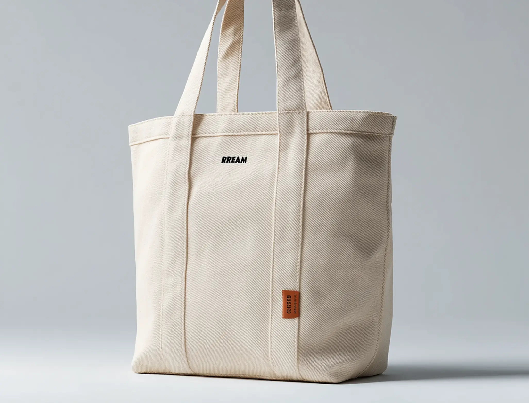
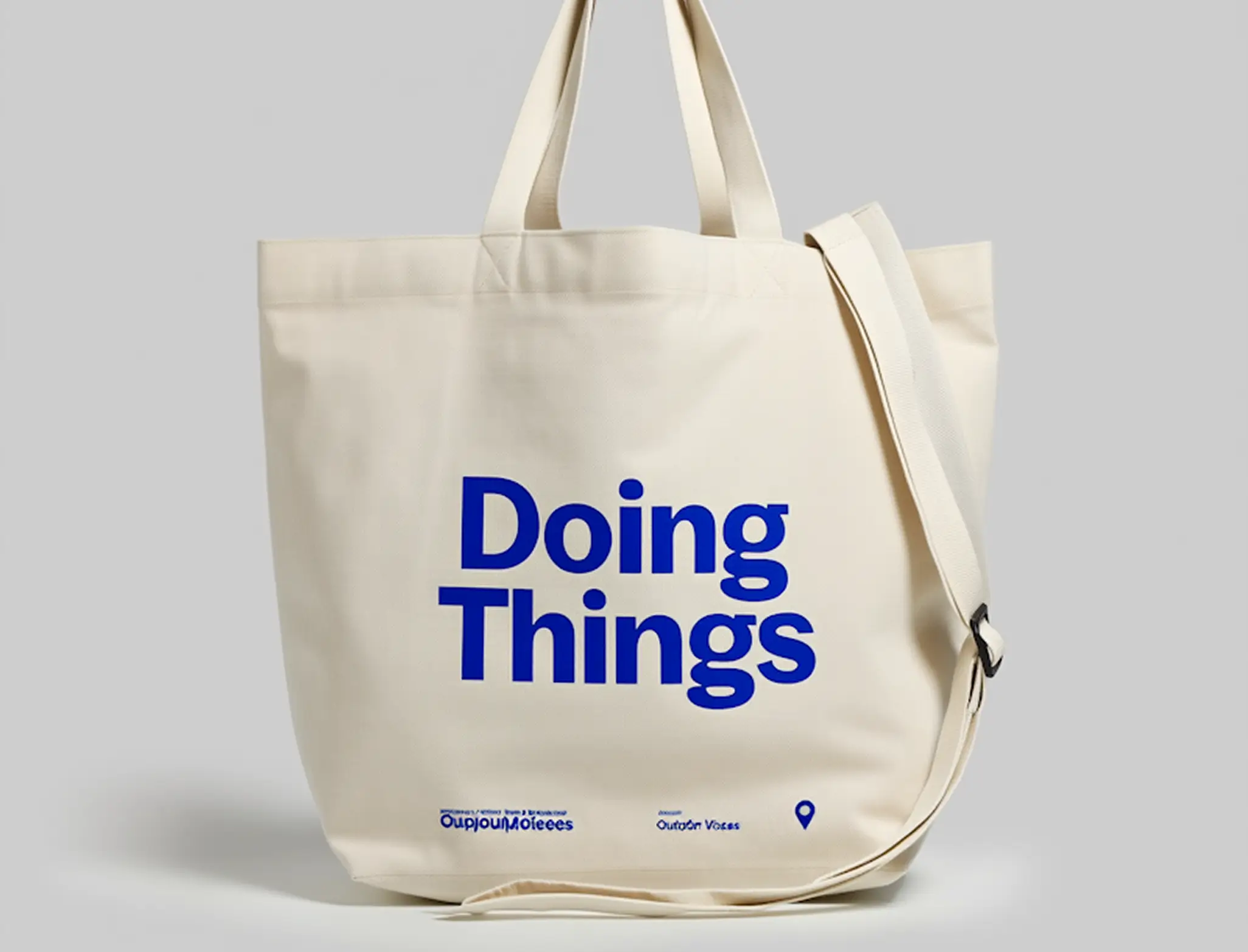
Based on the positioning strategy, we developed a modern and adaptable visual system. This included logo exploration, refined typography, and a color palette aligned with sustainability and freshness. The goal was to create a distinctive yet flexible identity.
Packaging & Touchpoint Design
We redesigned packaging concepts to improve shelf visibility while maintaining clarity and simplicity. Digital touchpoints — including social templates and website direction — were aligned with the new visual language.
Brand Guidelines & Implementation
To ensure long-term consistency, we created a comprehensive brand guideline document covering logo usage, spacing rules, typography hierarchy, imagery style, and tone of voice. This enabled internal teams and partners to maintain brand consistency across all future materials. The strategy focused not just on aesthetics, but on building a structured identity system that supports recognition, scalability, and long-term growth.